This week, the third book in a series covering the vintage Star Wars card sets made by Topps was released. You have probably seen information about these books; they feature the fronts and backs of all of the vintage SW cards (including the Wonder Bread and Giant Photo Card sets). I'm a little split on the books--the format has been highly complained about, in that a lot of page space is wasted. A larger format could have accommodated multiple cards per page. As it is the books are chunky and unwieldy. The text is by Gary Gerani, who was the original writer on the card sets. He shares some anecdotes and trivia that are very cool, but honestly, the farther you get in the series, the less there seems to say.
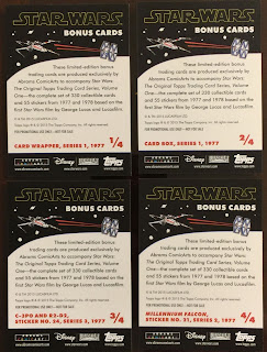
But I'm not here to review the books. Each book includes (at least) 4 exclusive Topps trading cards, and when the first book was released, I scoured the Internets to find out what the cards looked like. I found nothing. This subject has been so woefully under-reported, I figured it would make a good blog post. Anyone interested in the books (and I really do recommend them) can now at least SEE what they are getting!
 |
| To me, pack and box art make perfect sense, but re-creating a card of an existing sticker card is redundant (and these are cards only, not stickers). |
 |
| I mean, if they were unused sticker designs, it would make sense. |
I hope this helps somebody. I mean, that's what the Internets are for, innit?


2 comments:
There's a publishing trend with these types of pop-culture themed, coffee table, art books that's been going on for well over 10+ years now. Flipping through, you will notice some pages that are out of whack with the formatting style with the rest of the book. Examples are; randomly chosen images will be extremely magnified up to the full page (to make them look more arty), or, as you have said, framed on a page with a lot of wasted white space. It all comes across as overindulgence of the imaging software used in the creation of these books instead of allowing the artistic merit of the subject to naturally speak for itself.
That's so true--plus, I neglected to mention that these are scans of cards that were rather low-quality image-wise, anyhow, and it often shows...not to mention that they were sometimes mis-cut sloppily!
Post a Comment